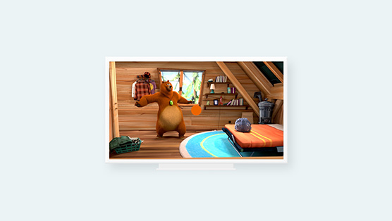
super rtl’s toggo is germany’s top brand for children. since many years toggo evolves on television, online, within its app, as a radio station etc.
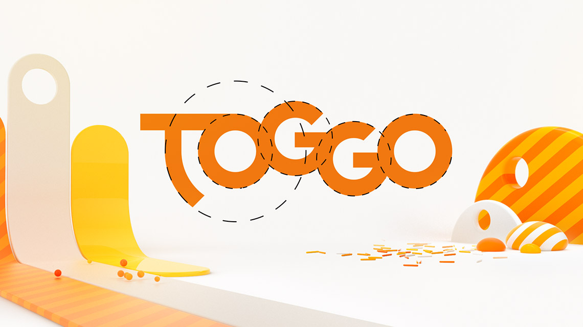
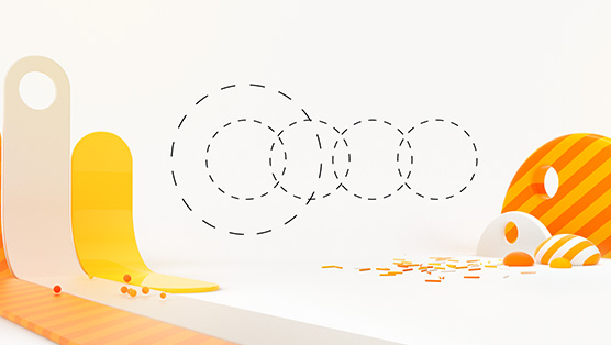
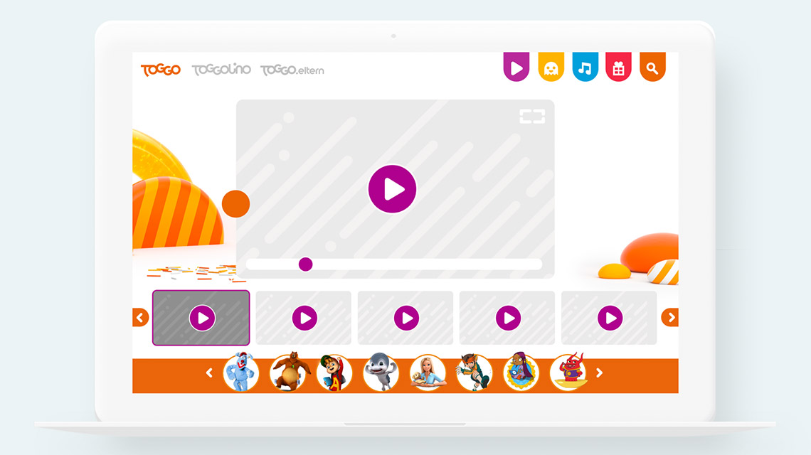
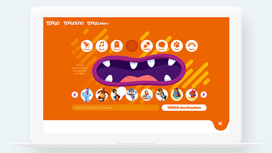
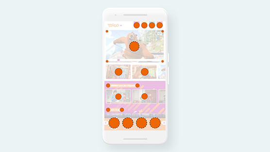
our task was to develop a concept that refreshes the brand and at the same time establishes a design concept that can be used on all the different platforms where toggo performs. we came up with the idea of a circle.
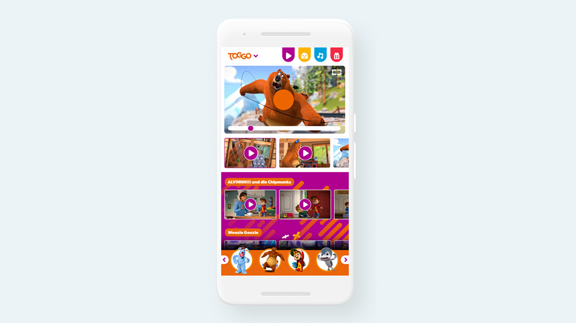
a circle (or a sphere) is regarded as the perfect symmetrical shape. some design theories even go further and claim that everything on earth, even us humans, tries to be a sphere but gravity stops our approach and makes us look the way we look.
we used this thought and created an orange circle that can transform into anything it wants before going back to being a circle. for example: on television it transforms into all the elements used within the daily broadcast, on a website it acts as the cursor, within the app it can be found within every button and in classical print advertising it is the spotlight that highlights the cartoon heroes.
this concept was developed in co-creation between grade die. and super rtl, displayed by the animated spot above and used as kick-off to start the channel’s refresh.