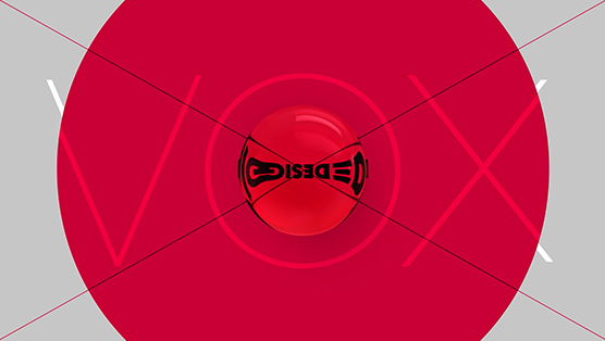
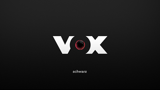
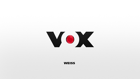
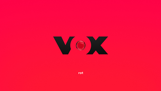
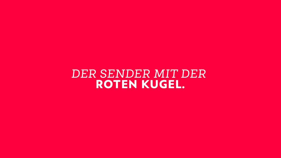
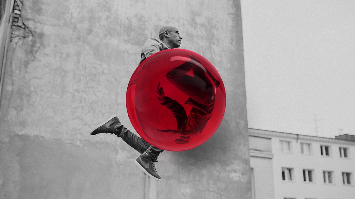
vox is one of the most prominent german television channels, best known for it’s trademark: the red sphere. in the past few years the company kept expanding and developed into one of the big players on the market.
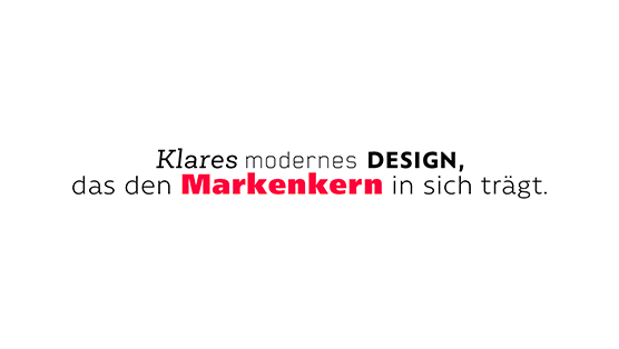
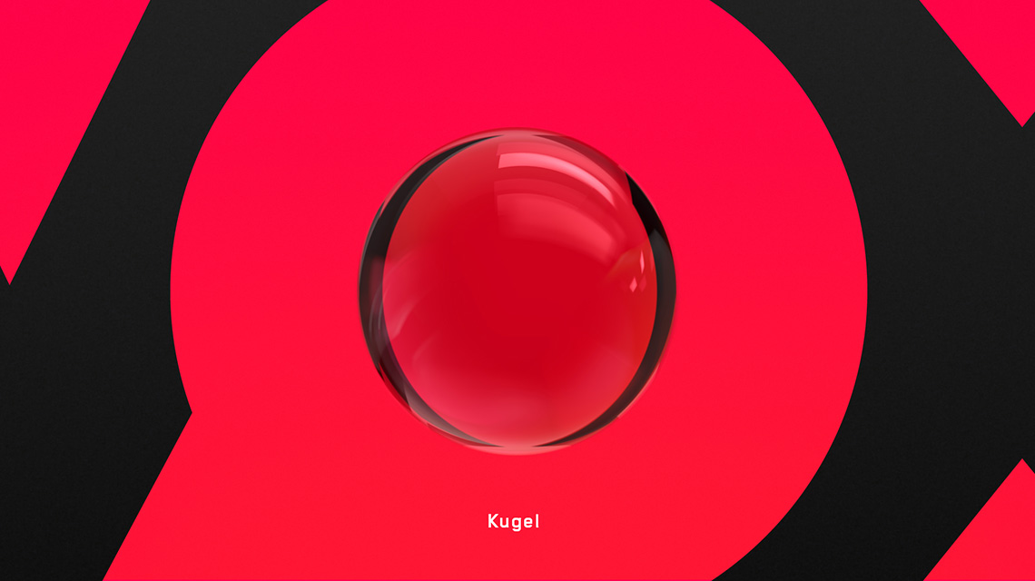
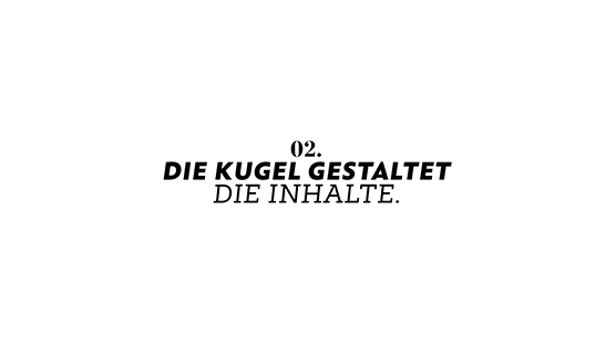
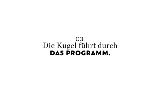
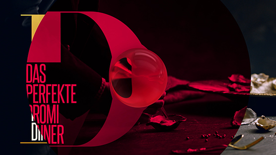
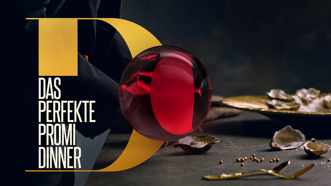
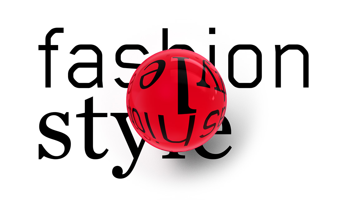
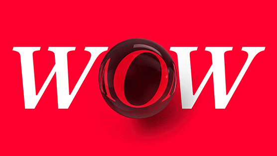
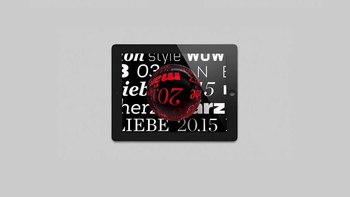
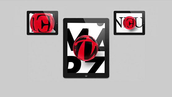
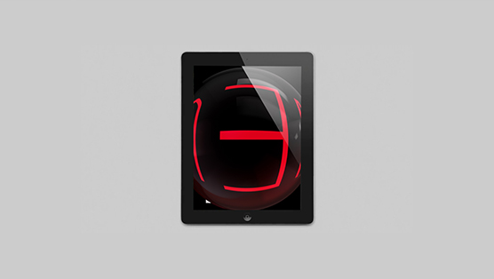
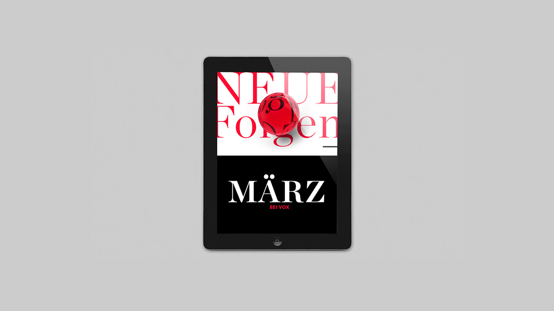
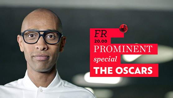
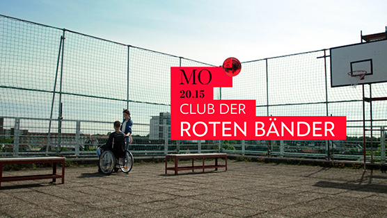
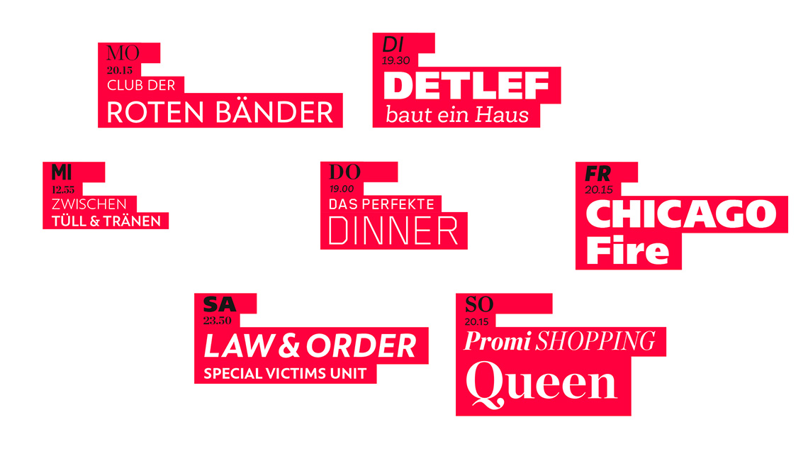
our task was to articulate this new point of view and create a corporate identity that aligns a clear, modern design that highlights the main trademark. So we came up with the idea of a layout in which the red sphere is bigger, lighter, transparent, intense and diversified. it moves, interacts and presents the program to the viewer. it is now the main element through which the content of the television channel is expressed.
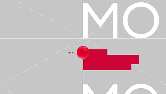
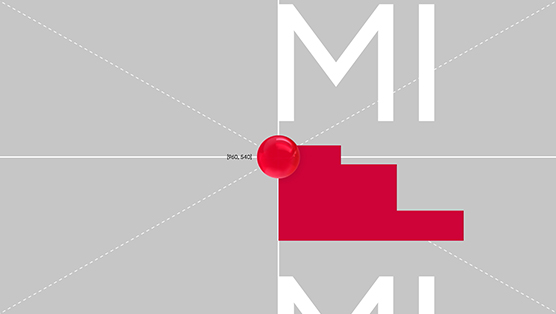
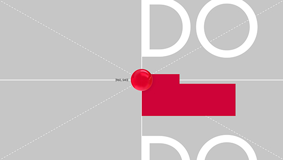
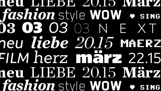
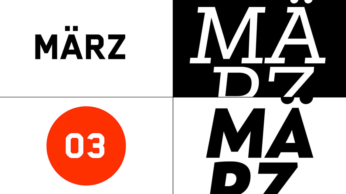
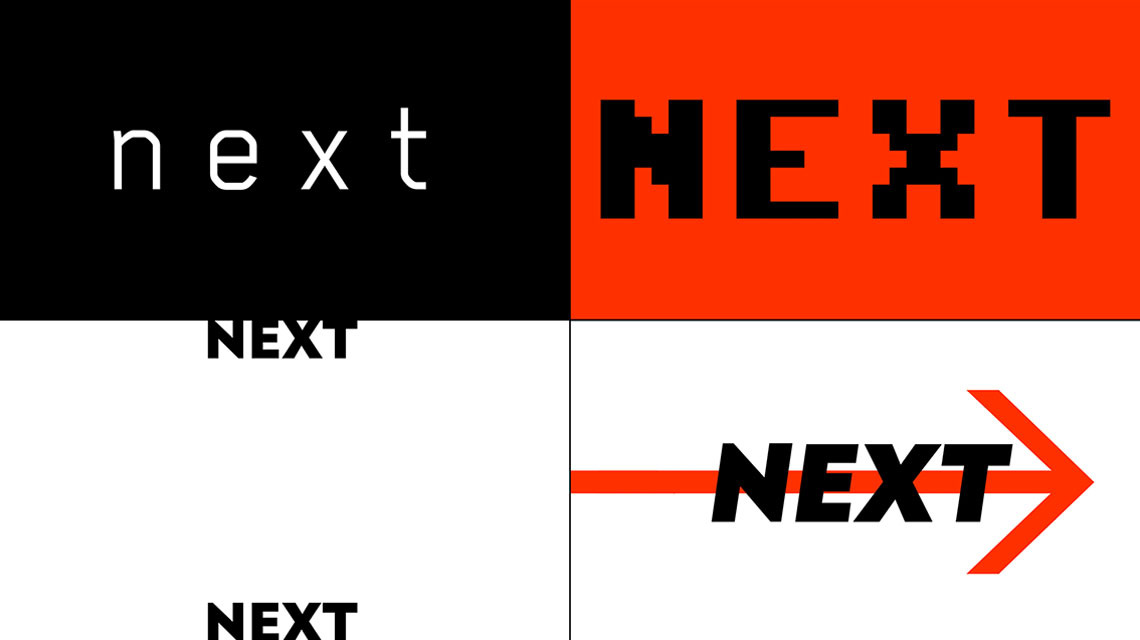
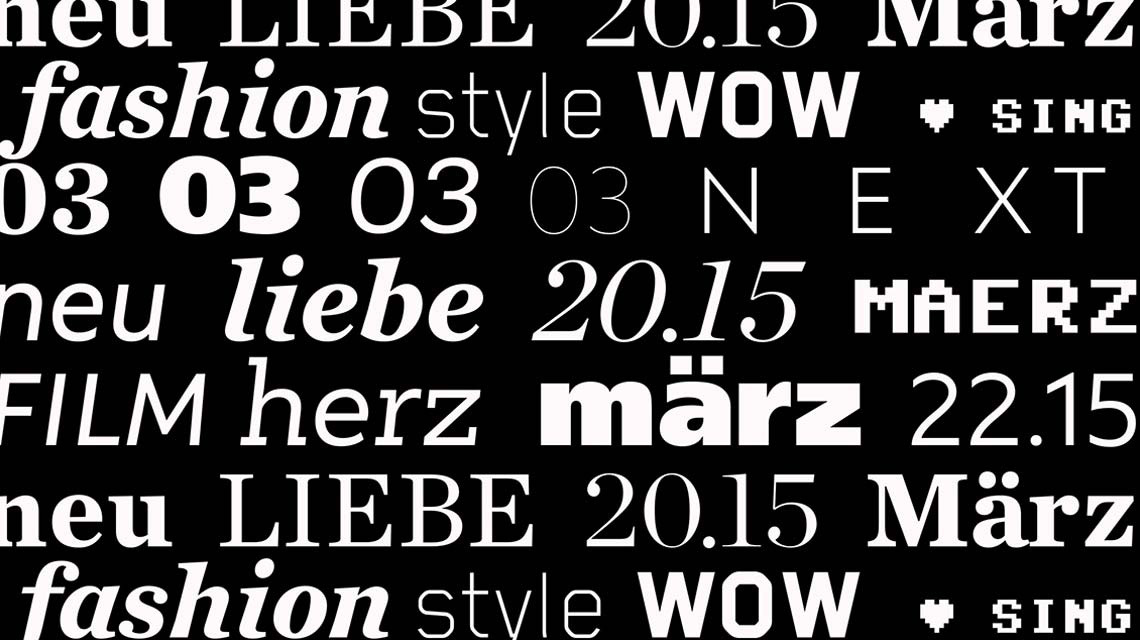
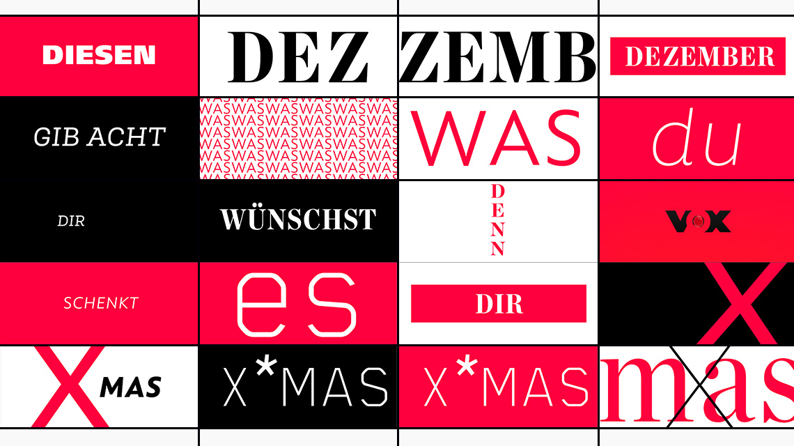
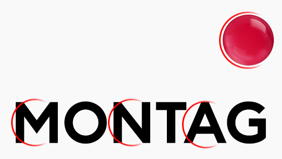
to further underline this clear vision we came up with a typographic concept that is playful, present, big and brave using nothing but the three main colours of the television channel: red, white and black.
the channel-redesign was developed in co-creation between grade die. and mediengruppe rtl and can be seen on the daily program of vox. the work presented to you here on gradedie.com is a case study of our seven month long design process that led us to the final design.